My logo is a camera with my site name on the inside. I also use a checkered outline for the camera because it looks very cool and makes my logo unique. It was very easy to get the idea for a camera because we are in photography class. It was difficult to create the right font size so that the words could correctly fit into the camera. If someone were to use my image I would want them to put my logo on the image so that I got the credit that I deserved. I usually get my images off google images, and I did not source the image or contact the owner of the photo or image. From now on, I will give credit where it is deserved.
Nata’s Logo
When I’m assigned an assignment for my classes I get my photos from Google. No I do not contact the owner of the photo. I would give credit to the photographer because he or she was the one who took the picture. I would expect that person to give me credit for my photo. When I was designing my logo I thought of putting an eye and a flash in the middle because it defines how people look at the photo and how a camera flash can simulate taking photos. The easy part of making my logo was having the idea but making it come to life was the difficult part.
24 colors
While I’m taking those photos, I found out there were some challenges. One challenge I faced is that I had to take photos from different angles so I had to hold my phone in different directions. But through those challenges, I found some methods that could easily take a good photo. One method is to ask your friends to hold the crayons and to take a picture, only when the crayon is on the wall. One thing I like about this project is that we could show our skill or the ability to define different colors.click to see my photos
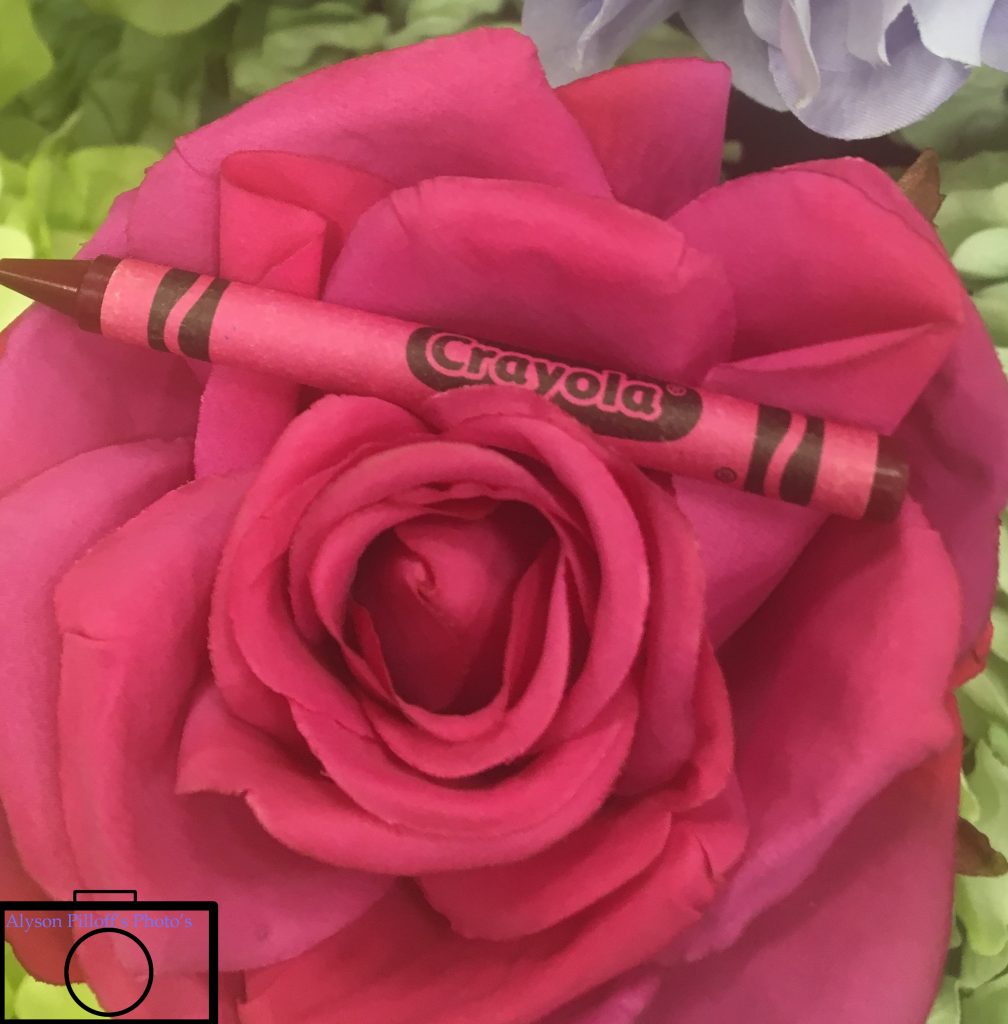
24 Crayons
The first step my group did was finding colors around the school and seeing if the crayons matched. The second step was to find the right angle to position the crayon so it looks decent and take the picture. One of the several challenges had was finding the right shade to match the crayon with. Adding on, there weren’t many warm colors around the school to refer to. I like the picture shown because I think the crayon and the colored patch and the crayon went together perfectly.
Click here to view my other photos https://drive.google.com/drive/folders/1mfgcOgmsuDgTh9B1TtN8CgTVQrtSkBq4
24 Colors
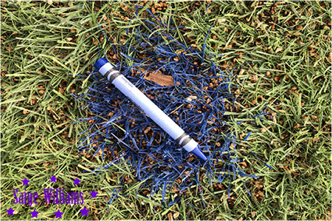
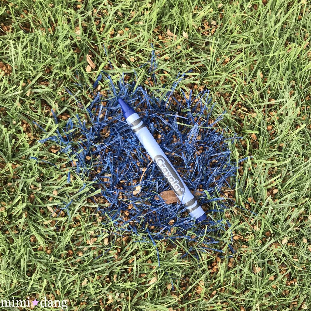
The first thing we needed to do was to get 24 crayola crayons. Then we went all around school and we also went outside to take photos of my crayons. The crayons needed to match the background. A challenge was that we couldn’t find some colors that matched some crayons. Another challenge was that we didn’t get much time to take a lot of photos. It was easy to find the basic colors of the crayons like black, grey, white, etc. My favorite photo is the photo below because the blue crayon matches perfectly with the background color.
Click here to view my other photos.
24 Crayons
For this project, we had to take a picture of something with a similar color to each crayon. Because each box has random amounts of each color, I had about six blue crayons. This made it very difficult to find six objects with the same color. once we found a matching object to a crayon, taking a picture of it was very simple, since no fancy angles were required. My favorite photo was the one shown above. I managed to get the crayon perfectly aligned with the painting on the first try. Here is a link to my other photos:
https://drive.google.com/open?id=1wyt8AiqQaJ9wIuQ297UsltzZeqsCdscV
24 Colors
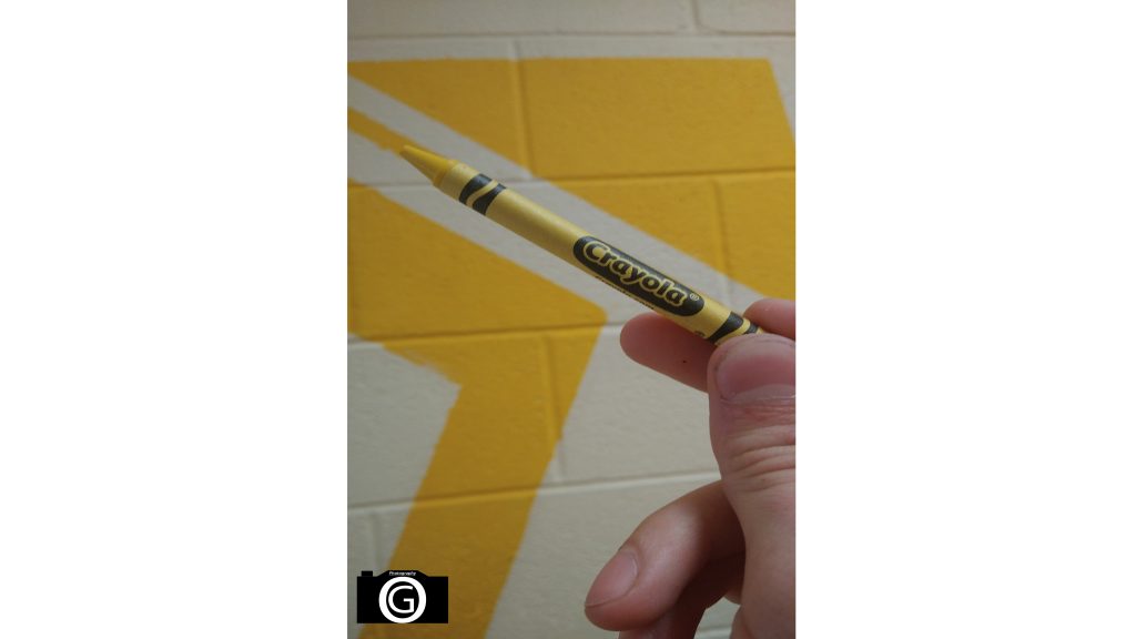
This project was about getting a box of 24 crayons and going around the school to take pictures of colors that matched the crayons. Some challenges of this project were getting the exact same color of the crayon because some of the colors were a different tones and it was hard to match them completely. Some things that were easy for me were the simple colors and going outside to take the more “natural” colors. My favorite picture that I took was of one of the orange crayons because I got the exact color and it was easier to find in my opinion. Here are my pictures.
24 colors
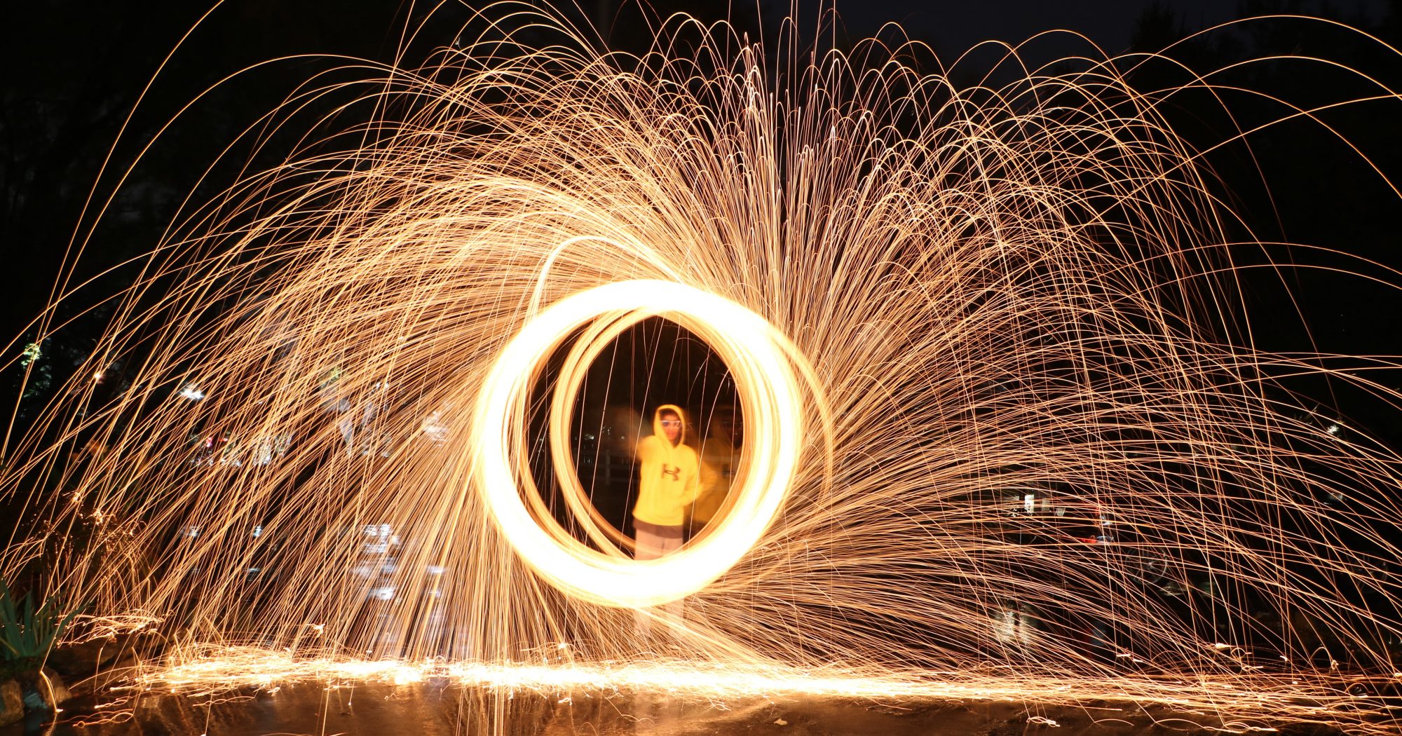
This project was about having 24 different colors and going around the school to find objects that match that color. Some colors were very difficult to find because there were so many different shades and you never knew if that one was the perfect one. But obviously the primary colors like yellow, red blue were easy to find but once you got more into deeper colors it was more challenging. My favorite display was the dark blue one matching with the sweatshirt, and I thought this was very cool because this color perfectly matches a random sweatshirt.
24 Colors
The assignment was to match 24 colors with 24 crayons and take a picture. The challenge was finding a color that matches the crayon. This was hard because there were not many colors that look the same. The easiest part was taking the picture because you already had the crayon lined up. Once you found the color and got the crayon lined up all you had to do was click a button.
My Logo
During class when they would like me to add photos I usually go to Google unless there are certain requirements. I usually don’t give credit most of the time. If someone would take my photo and not give credit I wouldn’t like that because I worked hard to get my photos, I would like credit. The way I came up with my logo was by making abstract art. Picasso inspired me and one of his photos and the rest of my class has a camera in someway but I would like to be different and just make something different. It was difficult to design my logo because I didn’t know what to make but I just made something.