#ProLevel

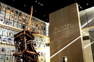
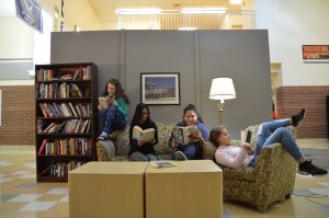
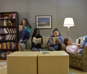
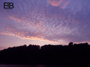
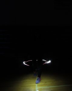
Throughout this year in class, we have done many projects centered on improving our photography skills. Our first assignment was designing a  creative brand logo to insert on our pictures. Afterwards, we did a number of other projects including “24 Colors”, “App Review”, “Infinite Background Portraits”, “Light Graffiti”, “Rule of Thirds”, “7 Days”, “Set in the Street”, “Newseum”, “Smile”, and “#ProLevel”. We had a chance to use editing softwares such as Adobe Fireworks and Adobe Photoshop in order to enhance our final products, too. In addition, we were required to write reflection responses on our websites that demonstrated our knowledge while allowing us to define the purpose of doing the project. Some of the highlights of this course was visiting the Newseum and putting together a mini “living room” in the main lobby for Arts Night. My thoughts have definitely changed about photography. Before taking this class, my impression of photography was that it was super easy, boring, and meaningless. I concluded that it was just taking pictures. However, I realized that photography has a deeper meaning it’s an art that calls for tons of practice and patience. In other words, it’s harder than it looks. I have changed the way I take pictures as well. Now, I use techniques like composition (rule of thirds), lighting, and color. My favorite project was “24 Colors” because it was challenging yet fun. I loved how you had to be original and think outside of the box. Photography does interest me as a career. No doubt, I want to continue learning it next year in high school. Not only does it teach you valuable lessons and allow you to see how much beauty is all around you, but it also enables you to capture a memory that lasts forever. Overall, it is thoroughly enjoyable and worthwhile!


https://photos.app.goo.gl/kW8cL1SJjBt30DMT2

Smile

Throughout winter break, we worked on a project called “Smile”. Our goal for this assignment was to create a collection of 30 photos. This means that we had to gather pictures of 15 different people one photo of them smiling and another photo of the same person not smiling. After this, we put the two photos side by side to become aware of the fact that we tend to create stereotypes of someone even when we haven’t actually met them. This is especially true when we see a non-smiling face. Though there wasn’t much of a difference between both photos in some cases, the change is usually apparent most instances. For example, a lady is shown smiling on the right hand part of the photo below. Her smile is warm and welcoming, portraying the image that she has a bright, friendly nature. I would gladly approach this lady and start a conversation with her only because her face seems inviting. It causes you to think that she will be happy to talk to you. On the other hand, I would be reluctant and super nervous to go toward the same lady who is not smiling. Truthfully, I would keep my distance because the lady’s straight face reveals that she isn’t interested to talk to you. It is also scary and intimidating to say the least. However, she is still that kind person on the inside. All in all, the point of this project was to reflect on our actions and take away an extremely important lesson. We are all prone to being a little too quick to judge. Assuming something about someone is not right; instead, we should take the time to know the person before supposing that our guesses are true.

https://photos.app.goo.gl/zd8q55cAD5xFncXw1

7 Days

I am thankful for my family because they support me unconditionally and motivate me to be the best version of myself that I can possibly be. From manners to responsibility, my family has taught me everything I need to know in life from the beginning. Likewise, I can always count on them to be there for me when times are tough as they keep me focused on the path ahead. They refuse to give up on me regardless of what happens. All in all, I simply would not be here without them.

I am thankful for music because it brings happiness. When you’re feeling down, it can improve your mood drastically. Sometimes, music has a deeper meaning–it has the power to bring you back to a vivid memory and spark particular emotions. Those who have to ability to play an instrument or sing are granted with the opportunity to share joy and happiness with others who need it. No matter if it’s background music or live entertainment, it makes any event more delightful.

I am thankful for art because it reflects the freedom of expression. Since the only thing that can possibly hold artists back is their own creativity, there are no boundaries. They create emotion and feeling with their works of art, infusing their hopes, dreams, worries, and more into their projects with a wide range of tools as well as media available. Lastly, life is more enjoyable in a life full of art. We take the art that surrounds us everyday for granted, failing to realize how dull the Earth would be without it.

I am thankful for good health. The capacities allowed by our health is directly dependent on our emotional and physical strength. It is the foundation of who you are. Therefore, I understand that good health is one of life’s greatest blessings! Without it, we wouldn’t be able to enjoy life to the fullest or strive to achieve our goals. In addition, we would simply be unable to do many everyday activities easily.

I am thankful for food. It’s heartbreaking to know that world hunger remains a persistent problem despite the efforts of many nations and organizations working to reduce it. Sadly, hunger is a daily reality in a number of countries in the world. We tend to forget how fortunate we are to have an abundance of food. If we put ourself in someone else’s shoes (who was suffering from starvation), we would realize how grateful we should be to find food in our fridge everyday without having to go great distances. With that being said, it is such a crucial part of our survival.

I am thankful for nature. The breathtaking scenery of trees, trails, mountains, rivers, and lakes are priceless. Best of all, these beautiful places are away from the city atmosphere. The great outdoors can certainly be comforting, too. The fresh air has this amazing power to open your mind, give you clarity, and decrease levels of stress. There’s nothing like immersing yourself in nature!

I am thankful for freedom. Fortunately, we live in a country where we have the right to openly express ourselves. Life without the freedom of choice, expression, and how we want to live would be misery to most of us. Existing under circumstances where you are told how to live, think, behave, and be is reality in some countries. We should be grateful that our country, America, deeply values freedom.

https://photos.app.goo.gl/l8Z2zylj0cA2INc22

Newseum

The first image I viewed from the Newseum’s Pulitzer Prize photo gallery is called “Kosovo Refugees”. In 2000, photographer Carol Guzy spent time at a refugee camp in Albania during the Kosovo crisis. The award-winning photo depicts a young boy being passed through a barbed wire fence at the border. I was drawn to this photo because the extraordinary use of visual elements allowed me to connect to the child struggling between the fence. In my opinion, “Kosovo Refugees” is among the most strikingly emotional photographs mounted in the Newseum. No doubt, Guzy’s photograph is effective in evoking emotion. As I gazed into the child’s eyes filled with fear, my heart broke. The frantic environment captured by the photographer delivers the underlying message of conflict and desperation. I felt sympathetic towards the two-year-old child who seems so panicked… it’s hard to imagine that thousands of ethnic Albanians were forced to flee their homes in Kosovo.


The second image I viewed from the Newseum’s Pulitzer Prize photo gallery is called “Chiapas Racers”. In 2003, photographer Don Bartletti documented the desperate migration of Central American children searching for parents who had immigrated to the United States. Amazingly, he decided to ride atop of a train with the children who were in search of their parents. The award-winning photo portrays a young boy and girl who are on a horse racing alongside the train in the jungle. I was drawn to this photo because these children were smiling and laughing, unlike the other children Bartletti had photographed. Although they were risking their lives in search of their parents, they were still thoroughly enjoying themselves. The expressions on the children’s faces made it seem as if they didn’t have the slightest idea that they were on a treacherous journey. Therefore, I find it significant that it captures the emotional differences between the issues occurring and the individuals in the photograph. Not only is the image unique and special in its own nature, but it also conveys a powerful message about living life to the fullest. I felt joyful after viewing this photo. Most photos that have won the Pulitzer Prize tend to directly demonstrate the emotional reactions to sad events or issues, whereas “Chiapas Racers” does the opposite.


Truthfully, I don’t think I would be able to separate my job from being human. Some of the struggles of being a photojournalist include witnessing these heartbreaking events with their own eyes. Despite the fact that they are capturing a historical moment that others will be able to learn from, it must be extremely difficult for them to decide between taking a photo or saving someone’s life. Sometimes, photojournalists can’t help given the circumstances. It is painful to imagine how much guilt weighs on them and how they have no choice but to live with that regret forever after.


My favorite exhibit was the 9/11 Gallery & Film because it has remarkable first-person accounts from journalists who covered the story. My favorite artifact in it was the 360-foot antenna mast that toppled from the World Trade Center’s North Tower when the building collapsed. The antenna served most of New York City’s television stations. This exhibit fits in with the rest of the Newseum because records of the tragic yet historical event allow people to get a deeper understanding of the past.

Set in the Street

Throughout the past few weeks, we worked together as a class on a project called “Set in the Street”. Inspired by photographer Justin Bettman based in New York City, the challenging yet fun task was a great learning experience. First, each of the three groups was required to cut the wood into pieces that measured 4 by 8 feet. We took turns nailing the beams of wood together in order to form the base. Next, we laid the drywall on top, attaching it by tightly screwing it into the frame with a drill. After that, we used drywall mud to conceal any unnecessary holes that were visible. Once it dried overnight, we used sandpaper to finely smooth the surface. This ensured that it wouldn’t be seen after we painted. Then, we painted two coats of gray paint onto the walls and allowed it to dry off. Next, we brought the three walls to the main lobby so that we can connect them. Finally, we brought couches, a bookshelf, and other props from the teachers’ lounge to make it look like a basic living room. As part of the hands-on activity, there were several challenges that we had to overcome along the way. It was extremely difficult for me to use the drill because you had to be gentle and use enough force at the same time. Sometimes, it would drill in crooked, meaning that we would have to redo this single step until we got it right. However, it was easy to complete the rest of the construction process with the help of my classmates. Painting the wall seemed to be the least complex step in my opinion because it was simple and only took about five minutes. Although the project was time-consuming, the final product was amazing and a great success.

Rule of Thirds

For this project, we were required to take two photos inside the building (with and without people) and two photos outside the building (with and without people). In order to do this, we had to use the rule of thirds, a compositional technique that naturally contributes in building visual interest and improving balance within the photo. In the rule of thirds, photos are divided into thirds with two vertical lines and two horizontal lines which make three columns, three rows, and nine sections in the images. Important compositional elements are placed on or near the guide lines and intersection points. Throughout the process, I had to overcome several challenges. For example, it was challenging to make creative use of the negative space, or the empty areas around the subject. This was particularly difficult to do in a school environment. It took me awhile to get used to the rule of thirds, too. Due to force of habit, I constantly took pictures with the subject in the center at first. Therefore, I had to redo many of the shots I took. However, I changed the settings on my camera so that a rule of thirds grid appeared onto my photo. This made this project easier because it removed all guesswork and helped me get my positioning even more accurate. Lastly, it was easy to enhance my photos on Adobe Photoshop and apply my brand logo on each of them.

https://photos.app.goo.gl/wdr3JeaaDyYQnHIG2

Light Graffiti

Our goal for this project was to take pictures that achieved a “light graffiti” effect. We would do this by setting the shutter speed to 15 seconds so that the lens would absorb enough light that we were flashing from our phones, Christmas lights, and/or glow sticks. Throughout the project, our group had to overcome some obstacles. For example, whenever we set the shutter speed too low, we wouldn’t have enough time to paint. Whenever we set it too high, an excessive amount of light would hit the sensor. Other times, we just needed to redo the process because we needed more practice to “paint” the subject. Also, the subject would have to stay completely still. Even the slightest movement from the person or camera would cause the picture to appear blurry! However, something that worked was editing them on Adobe Photoshop. It was easy to enhance our photos using curves and other effects.

https://photos.app.goo.gl/mSQYgXHK2bpgKwCr1

Portraits

Our goal for this project was to take pictures with a white background and edit them once we finished. In order for the background to appear white, we had to adjust three settings on the camera. These manual camera modes included the ISO, Shutter Speed, and F-Stop. I edited these photos on Adobe Photoshop, applying curves to brighten, lighten, or emphasize certain tones within the picture. Using these editing tools worked very well. Also, using an external light source worked. This ensured that the background would be less dark when the picture was taken. However, the background would appear yellow if the lighting wasn’t good or if the settings weren’t adjusted in a way that would create this effect.

https://photos.app.goo.gl/I8qYd6VuIYGWd47o2


Portraits

Our goal for this project was to take pictures with an infinite background, using three camera settings. This ensured that the background would be black, yet enough light would be captured by the camera lens to see the person. These manual camera modes we adjusted were ISO, Shutter Speed, and F-Stop. I edited these photos on Adobe Photoshop, applying curves to brighten, darken, or emphasize certain tones within the picture. Using these editing tools worked very well. However, uploading the images to Google Photos was difficult because it wouldn’t work unless it was saved under a JPEG file. In addition, it was challenging to find just the right angle and lighting in order to create this darkened effect.

This is a picture of me taken by Connie.

https://photos.app.goo.gl/cBw2ipumBlCDvnz72

App Review

My favorite app on my phone is PicLab. This app allows you to enhance your photos with a wide range of features. For example, you can add typography that can easily be resized or rotated while adjusting the opacity of the text. Also, a collection of stickers and artwork (updated monthly) are available. Hundreds of image overlays such as shapes, borders, and textures can be used. Lastly, the photo filters and effects are amazing. These effects allow you to adjust the brightness, saturation, contrast, blur, and exposure of your photos. This will definitely be my favorite photo app because it’s simple to use. Not only that, but it includes plenty of features within a single app, too!

The online app I am reviewing is BeFunky. This app allows you to use a ton of fonts and photo editing tools to enhance your photos. Some of these include touch up edits, photo overlays and stickers, as well as creative photo frames. This is my favorite online editor because you can instantly save or share your edited photos. In addition, it’s easy to use and there are no watermarks.

https://www.befunky.com/create/