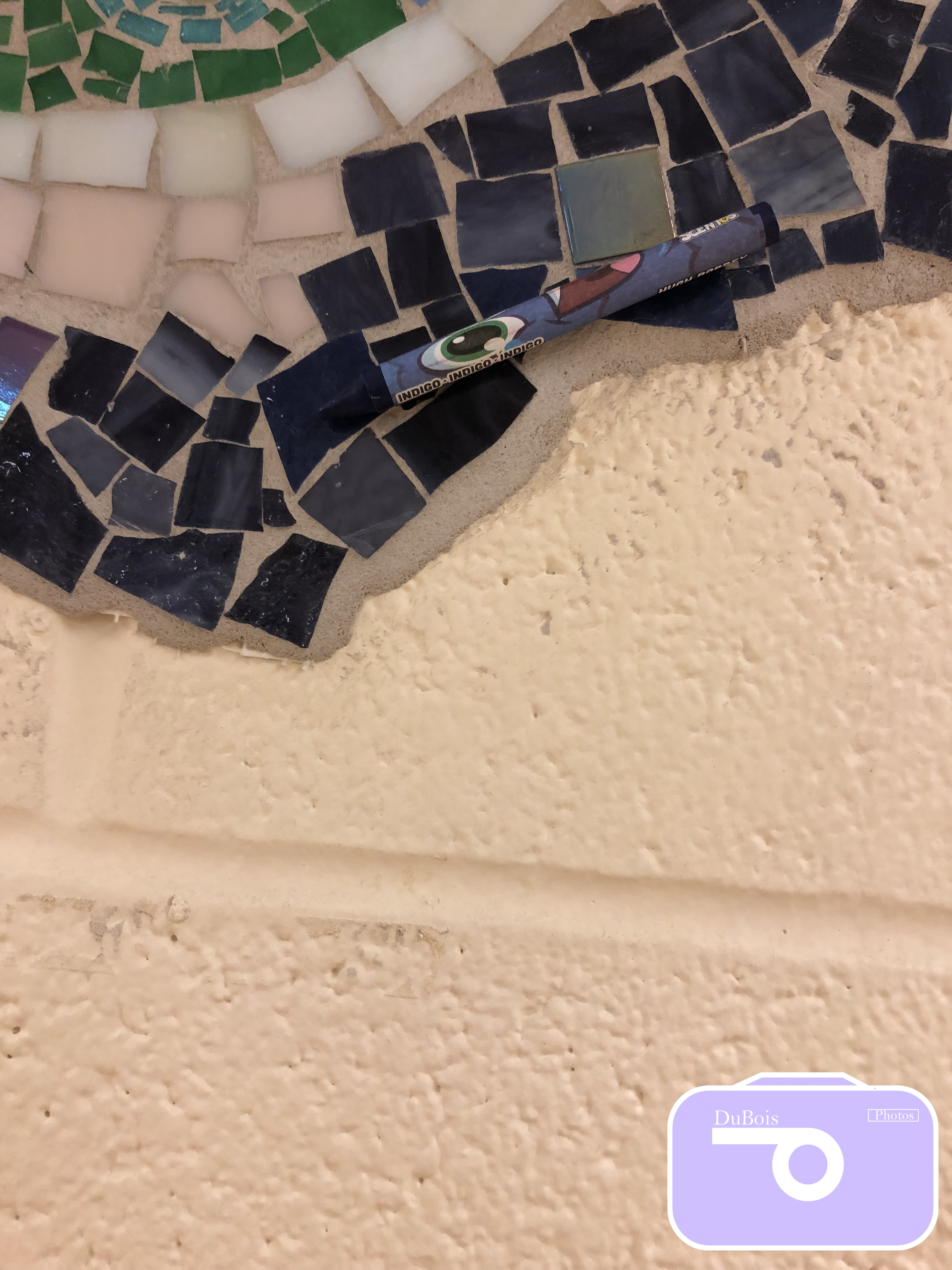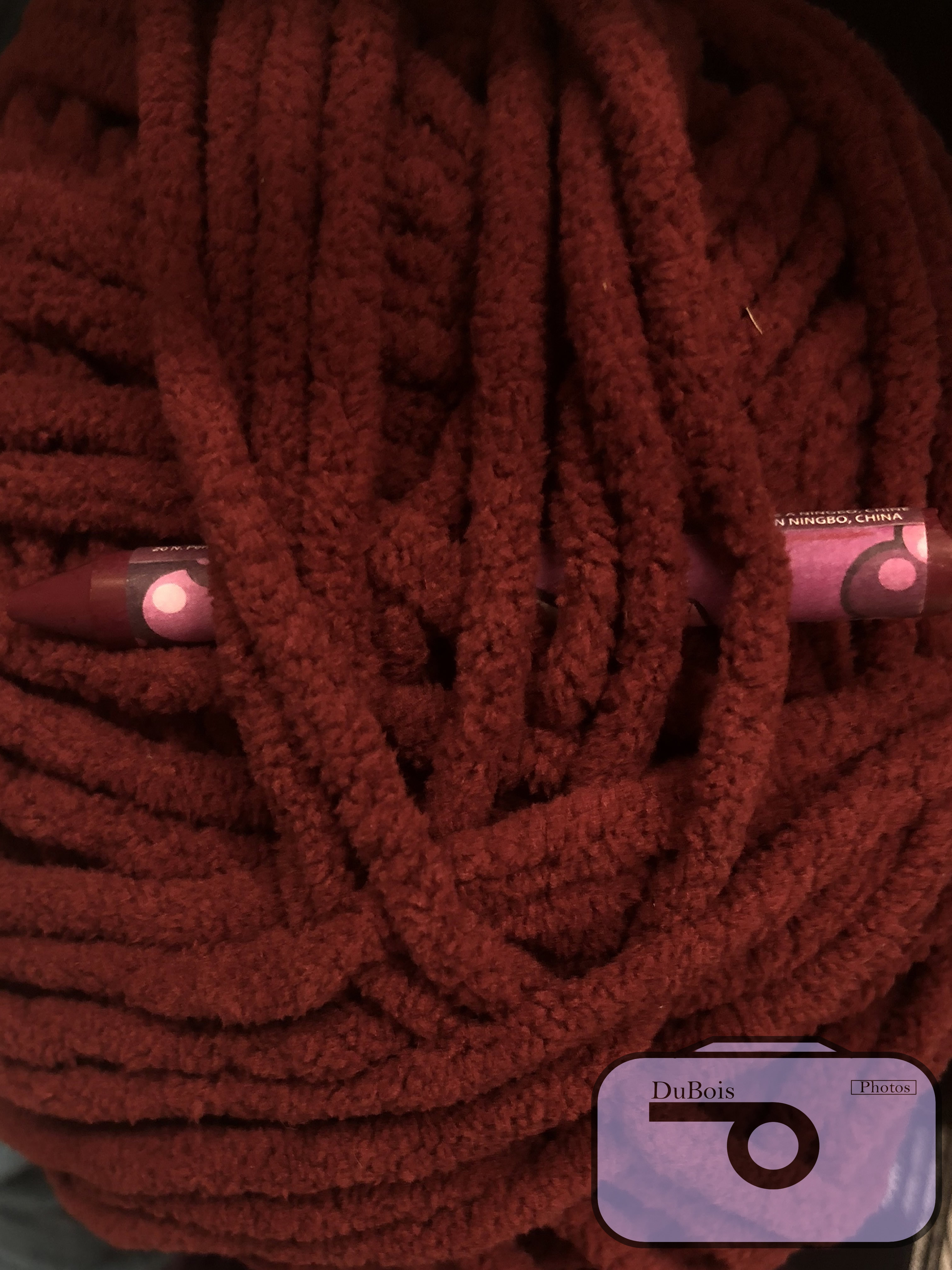
For the 24 colors project we went around the school or other environments that we chose and tried to match the colors of the crayons to objects that we found. This project was harder than I had sought out for it to be. One of the challenges I faced while doing the project was that usually when I’m finding colors I don’t focus on the exact shade I just look at the labels but for this project the labels might not be the exact shade we need. Another challenge was the crayons didn’t always work for the surface I needed, they didn’t stick well to glass so I had to find another thing that matched that didn’t have glass over it. On the other hand, it was easy to find the simple colors like orange and red but when it came down to the shades it got complicated. This project taught me that their are so many different colors with different shades that are eyes can be deceiving when we come across shades that are similar. Click here to see the rest of my photos.